
.png)
Hell0, is a project I completed in my last year of college. This project demonstrates all of my abilities in a single, attractively shaped screen with a sturdy supporting foundation. In our final year, we were requested to suggest a problem that we believed didn’t have a solution or that the ones existing didn’t meet the needs of the stakeholders. I focused on long-distance communication and the negative impacts of isolation. You can observe the procedure we as product designers, must follow to arrive at the finest possible solution across these pages.
Research
My research is based on primary and secondary sources. Since the scope of my topic was broad, finding interview subjects was not a problem, but I did need to make sure there was a good mix of people. For my primary research, I conducted 15 interviews with participants, sent a survey that received 85 replies, and engaged in some immersive testing by isolating myself for a few days. My secondary review included articles on speech evolution, communication, and impact of loneliness on the mind and isolation.
I have learned a lot about the nature of communication and how it impacts us through my studies. I divided up my audience and made observations from them, which I then used to create design guidelines. I collected 345 observations and identified six themes: socialization, mental health, communication, covid, routine, and first experience. The design manual and these themes then guided me to the next design stage of ideation
Design Guide
''A way to keep a healthy connection strong over long distances or times of change”
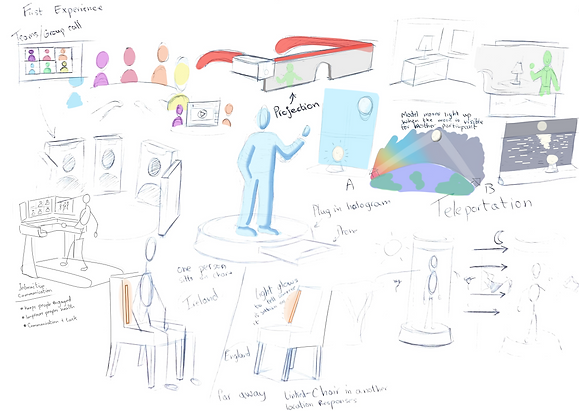
Ideation
Throughout this stage, I used a variety of ideation techniques, including negative brainstorming, where I tried to generate as many unfavourable ideas as I could before expanding on them.
I brainstormed ideas based on the six themes, frequently switching after each idea to keep my thinking fresh. I had 12 A3 pages of sketches with around 50 distinct concepts by the time I finished.


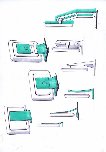
Concept Development


The next stage of design involves emphasizing three practical designs and turning them into straightforward concepts. These ideas were presented in front of the studio so viewers could ask questions and offer helpful critique. The concept I chose is a door the size of a screen that enables individuals to converse with one another as if the screen were an opening into another room in the house.
I then demonstrated the idea and tested the fundamental functioning. I ran several user tests. For months, I went through the process of creating a vision and then conducting user testing, gradually testing each element of the concept until I had a finished product. In the end, I had to scale back the screen's features to make it more appropriate for a home or office setting. The components of the monitor, which had been given the name ‘Hello’, were examined and given real-world technology, such as Samsung's hidden camera. My Monitor uses five hidden cameras to track the user's eyes and positioned in order to give a sense of depth and perspective while looking through the monitor. The manufacturing capabilities also influenced the features of the monitor. Since the stand was composed of stainless steel, some parts had to be cast while others were extruded.


Prototyping


I created a 1:1 scale model of the monitor's initial iteration; the model included working mechanisms that let me test its functionality and facilitate storyboarding. The foam was used to create the screen, and cardboard was used to create the base. These were utilized to provide preliminary dimensions, then I used clay to detail the concept. As a result, I was able to test the monitor's user interface and ergonomics, giving me a more polished shape.
Internal Components

User Experience


The hardest aspect of the entire project was conveying the idea and key benefits of the product. The animation demonstrates the adjustability of the stand before showing the user what the screen would look like during a call while moving around. I taught myself animation because I felt it would be the finest way to communicate, and more effective than using words alone.
The picture below shows the interaction between User and the Monitor by showing the Point of View from the user and the 3rd person's view of their position relative to the user.
User Point of View
Click to Move Right


Click to Move Right


User Interface
The interaction is made easy through user testing and secondary research because the concept is intended for all demographics, tech savvy or not. Every age group communicates. Login, Profile, Settings, Contacts, and Call are the five primary areas of the app.
Model making


Making a final model of the Monitor was one of my design's last tasks as it neared completion. It took a while to get the look right. The screen is created from firm foam that has been CNC-cut. The sculpture is constructed from two components. Due to the stand's distinctive geometry, which no other machine could produce, the stand and hinge elements were 3D printed. It was big, so I had to cut it into sections for 3D printing. Following that, it was simply a matter of perseverance as you repeated the process of sanding the surface and then adding primer. I sanded the surface until I was satisfied with the finish. The sections need to be joined together and spray painted as the last step. The hues were selected after extensive colour research. Since the motor had a nice shiny finish, I chose a slightly rough steel surface since it spread the light nicely and produced a mellow glow. When not in use, the design was intended to resemble a modest, tasteful ornament.
Marketing Board
Making a project marketing board was the last duty for my project. Along with the other students' projects, mine was shown in the Limerick Studio exhibition. I had to pitch my idea to my parents and other family members on opening night. A month later, the exhibition was put on display for the general public and judges. The exhibition was a fantastic way to wrap up the project, and I am ecstatic with how it finished.


